This project is to cooperate with Tampere history museum to renew the web page Power from the Rapids. (http://www.history.tampere.fi/main.htm). The website was established two decades ago, which is out of date with current standards.
Especially in the past 20 years, the development in Tampere have changed a lot. For example, there were two universities in the city. Now it becomes one large university community with the new name. Ten years ago, the commercial street is Hämeenkatu in the downtown, nowadays there are ratina shopping center, which is the new commercial area in the city of Tampere. There were only buses on the Tampere Street, now we have tram in the street.
This is the new era comparing to 20 years ago. Unfortunately, the website information was stopped at the year of 2000. There is a demand for reinventing the website, and to fulfill the updated content, with the new online technology to reinvent. Tampere city and Tampere history museum to send us the request to support this project. Because this is the new study to me as the fresh-man student in the school, I have not had to many ideas to think yet. At this stage, I can be from a user perspective to investigate into this project. My idea is to utilize the contents and make the minor changes according. The current content is great, but we need to add more information. Below is the short summary from my perspective.
Contents
When I read the webpage, I was bit confusing about the title. Power From The Rapids, in my understanding, I thought of some electricity power from the rapids. It perhaps something about the clear energy. After reading the content, I just realized here they used a metaphor. Would it be just easy to write straightforward as the history of Tampere. It would be easy to talk straightforward as the history of Tampere.
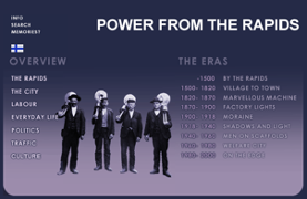
The tab info on the left side needs to be updated. I would like to keep the first tap “the rapids”, the articles in the tab gave us a detailed geographic information about Tammerkoski rapids. It is quite interesting info to read.
The pity is due to the old technology, we are not able to zoom in to see clearly about the pictures there. By the end of the page, there is information of factory areas, which is also an interesting piece to read. With the unknown reason, the web info of factory areas, national landscape and waterpower are not able to fetch from the main page. I assume many of the visitors would also miss the webpages of factory areas, national landscape and waterpower. This problem also happens to other tabs on the left.
There are too much information in the website, but it hardly to be organized well. There is a very heavy duty to make that historical information more organized so that the visitors can read them easily.
Design and user interface
20 years ago, such html website was very good one. It contains less images, more texts. We need to realize that 20 years ago the internet speed was quite slow. Such design has guaranteed a good browser speed. Now is 2021, the design is out of dated. We need to add lively images or new technology to the web page. It will attract visitors to spend longer time to explore the site.
My idea is to add a map of Tampere, and it shows of different attraction. Visitors can click the attraction place to read its history. It would be more interactive way to design the website.
These would be my brief ideas about this project. I am now taking different user studies course from the department. I think during the studies, my vision will be broad. At that time, I can make more effective suggestion for this project.