Loading

Project Design of Reinventing Power from the Rapids

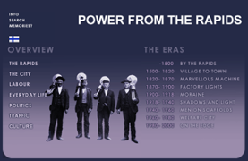
The project is called “Reinventing the Power from the Rapids”. This is a recreational project for renewing the webpage of Power of Rapids from Tampere history museum. (http://www.history.tampere.fi/main.htm) The website was setup by the end of last century. The information on the website was from 1990s.  It did not have any updates during the past 20 years. The core idea of this project is to bring up the newest information and updated technology to refresh the website. 

There are many features that needs to be updated on the website. When you have a glace of this website, you will notice the contents are out of dated. The web page is not supported very well by current web technology. The design of the website is hardly to be attracted, and the functionality of the website does not work well.  In order to support the core idea of this project, a service journey map will be introduced to find out how the website should be updated from the end-user perspective. 

A Service journey map visualizes the experience of a person over time. For example, an end-to-end customer journey map can visualize the overall experience a customer has with a service, a physical or digital product, or a brand. This might include recognizing a need, searching for a specific service, booking and paying for it, and using the service, as well as maybe complaining if something goes wrong, or using the service again.(Stickdorn, Marc, et al. 2018: p43) Even though service journey map is more often to use in the consumer-business sector, it can still help us to find gaps in online experiences and explore potential solutions.

When drawing the service journey, it is necessary to write down the stages of service journey. Stages represent the main phases of the main actor’s experience, such as, for example, the classic buyer decision process stages of “Problem/Need Recognition,” “Information Search,” “Evaluation of Alternatives,” “Purchase Decision,” and “Post-Purchase Behavior.” Stages help to structure a journey map and visualize its scale. Each stage normally contains several steps. .(Stickdorn, Marc, et al. 2018: p43) There are three stages from the user perspective for the project of Reinventing Power from the Rapids. There are UI design, content, and functionality. More detailed information will be listed under different stages. For example, under the stage of UI design, couple of elements can be identified from there, such as images, color of the website, and design, etc. The text information and the menu tab of the website will be under the stage of the content. The connectivity and useability will belong to functionality. 

Once the service journey map is drawn, it can identify the negative features that needs to be improved.  The next step will start to design the new feature of the website. Design process tool will be introduced at this stage. There are many design process tools in the service design field. But they ultimately share the same mindset and the same principles of service design. (Stickdorn, Marc, et al. 2018: p87) The most common design process was introduced by Design Council (2007). Frist to have deep research in the problem that is trying to be solved. Then synthesizing the information from the discovery phase into a problem definition. Once this is done, it is important to come up a solution to solve the problem. Finally, it is necessary to pick the best solution and start to build. 

To summarized, a service journey map will be drawn to identity problems from “Power from the Rapids” website. Once the problem is known, design process tool will be used to solve the problem from different solutions. In the end, the best one will be picked up to reinventing “Power from the Rapids”.

References:

Stickdorn, Marc, et al. (2018). This Is Service Design Doing : Applying Service Design Thinking in the Real World, O’Reilly Media, Incorporated, ProQuest Ebook Central, http://ebookcentral.proquest.com/lib/tampere/detail.action?docID=5219777

Design Council (2007). “11 Lessons: Managing Design in 11 Global Brands,” UK Design Council.
Why color matters on the web page?

The definition of color from the Encyclopedia Britannica refers to the aspect of any object that may be described in terms of hue, lightness, and saturation. Color is regularly used to guide behavior, such as green traffic lights, and please our senses. Color is something that affects us every day, and is constantly present in our lives. (Nordeborn 2013) In the psychological literature, colors are known to have various emotional and psychological properties (Lichtle 2007). 

When creating a web page, color is always the first element to consider in web design. It is a prominent part of website aesthetics and has been shown in the literature to have both positive and negative psychological effects. In the early 1990’s, web designers liked to use white color background with black text or a black background with white text, it was so called Optimal legibility. (Nielsen 2000) The design of the website “power from the Rapids” stems from  that era. It has a blue background and black text on the website. From the readability perspective, it is easy to browse and read. But as a city museum website, it was lacking characters. 

After the turn of the millennium, the mainstream of web pages became more colorful. They do not only have the black and white color elements, but various color combinations have been used in designing the webpage. It has been 20 years since the last update of the website “Power from the Rapids”. Now it is necessary to bring more color effect into the website. As research shows for the commercial sites, where aesthetic and purchasing behavior factors are a major concern, chromatic (colored) text/background combinations should be used. Chromatic colors are more likely to lead the viewer to see a site as more visually pleasing and stimulating. (Hall and Hanna 2004) This would be a direction when considering designing the new “Power of the Rapids” website. In order to attract more online visitors to the history museum, we need to utilize a different color combination to apply in the website design. 

References:

Nassau, K. (2020, January 7). colour. Encyclopedia Britannica. https://www.britannica.com/science/color

Nordeborn, G. (2013). Master’s thesis. The Effect of Color in Website Design: Searching for Medical Information Online,Lund University, Sweden.

Lichtle, M. (2007). The effect of an advertisement’s colour on emotions evoked by an ad and attitude towards the ad.International Journal of Advertising, 26(1), 37. 

NIELSEN, J. (2000). Designing Web Usability: The Practice of SimplicityIndianapolis, IN: New Riders Publishing.

HALL, R. and HANNA, P. (2004). The impact of web page text-background colour combinations on readability, retention, aesthetics and behavioural intention. NO. 3, 183–195. BEHAVIOUR & INFORMATION TECHNOLOGY, MAY–JUNE 2004, VOL. 23.

Initial Ideas about the Project of Reinventing Power from the Rapids

This project is to cooperate with Tampere history museum to renew the web page Power from the Rapids. (http://www.history.tampere.fi/main.htm). The website was established two decades ago, which is out of date with current standards.

Especially in the past 20 years, the development in Tampere have changed a lot. For example, there were two universities in the city. Now it becomes one large university community with the new name. Ten years ago, the commercial street is Hämeenkatu in the downtown, nowadays there are ratina shopping center, which is the new commercial area in the city of Tampere. There were only buses on the Tampere Street, now we have tram in the street.

This is the new era comparing to 20 years ago. Unfortunately, the website information was stopped at the year of 2000. There is a demand for reinventing the website, and to fulfill the updated content, with the new online technology to reinvent. Tampere city and Tampere history museum to send us the request to support this project. Because this is the new study to me as the fresh-man student in the school, I have not had to many ideas to think yet. At this stage, I can be from a user perspective to investigate into this project. My idea is to utilize the contents and make the minor changes according. The current content is great, but we need to add more information. Below is the short summary from my perspective.

Contents
When I read the webpage, I was bit confusing about the title. Power From The Rapids, in my understanding, I thought of some electricity power from the rapids. It perhaps something about the clear energy. After reading the content, I just realized here they used a metaphor. Would it be just easy to write straightforward as the history of Tampere. It would be easy to talk straightforward as the history of Tampere.

The tab info on the left side needs to be updated. I would like to keep the first tap “the rapids”, the articles in the tab gave us a detailed geographic information about Tammerkoski rapids. It is quite interesting info to read.

The pity is due to the old technology, we are not able to zoom in to see clearly about the pictures there. By the end of the page, there is information of factory areas, which is also an interesting piece to read. With the unknown reason, the web info of factory areas, national landscape and waterpower are not able to fetch from the main page. I assume many of the visitors would also miss the webpages of factory areas, national landscape and waterpower. This problem also happens to other tabs on the left.

There are too much information in the website, but it hardly to be organized well. There is a very heavy duty to make that historical information more organized so that the visitors can read them easily.

Design and user interface
20 years ago, such html website was very good one. It contains less images, more texts. We need to realize that 20 years ago the internet speed was quite slow. Such design has guaranteed a good browser speed. Now is 2021, the design is out of dated. We need to add lively images or new technology to the web page. It will attract visitors to spend longer time to explore the site.

My idea is to add a map of Tampere, and it shows of different attraction. Visitors can click the attraction place to read its history. It would be more interactive way to design the website.

These would be my brief ideas about this project. I am now taking different user studies course from the department. I think during the studies, my vision will be broad. At that time, I can make more effective suggestion for this project.